My 4 Good Websites
The Best Website In the World.
URL of Website < https://www.moddb.com/mods/stargate-invasion >
Link to Website < www.moddb.com/mods/stargate-invasion >
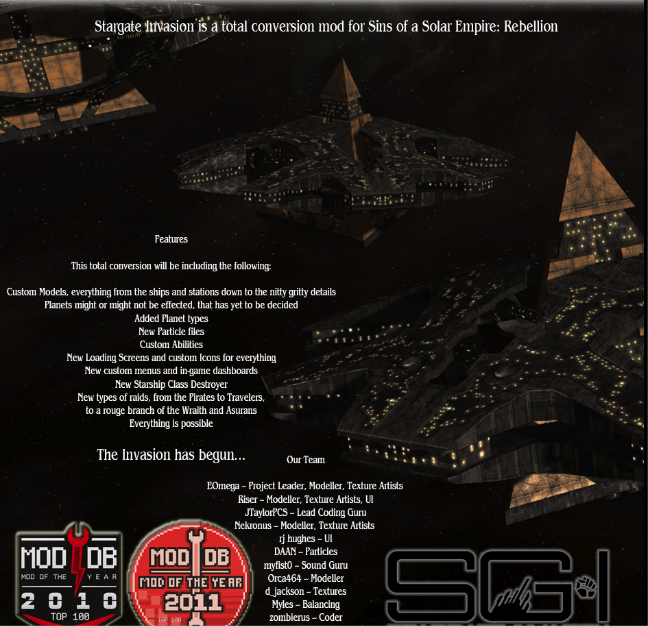
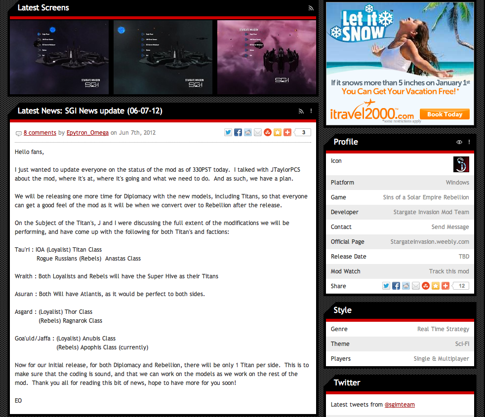
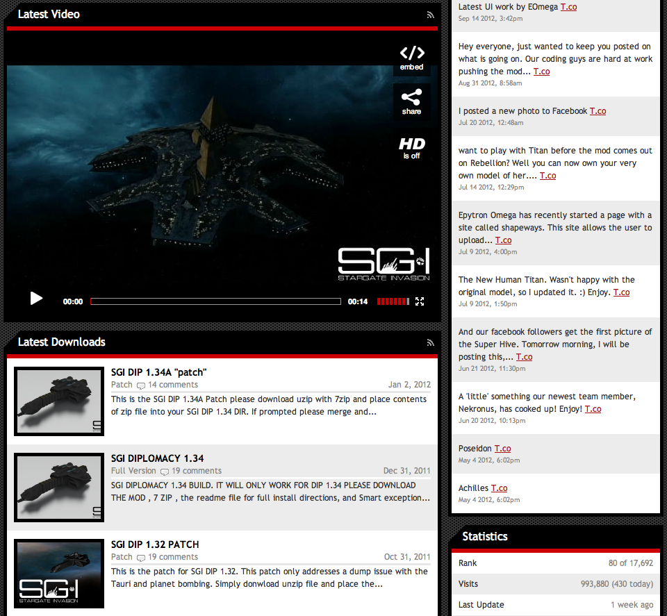
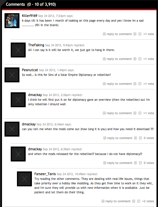
When you get on the website the title says what the website is going to be all about. If you scroll down more,you could read all of the changes that they will be making and the developers of the site. After that they have written the stroyline of the mod and then some pictures of the mod. Below that is a video of the mod and last the comments.The website has effective headers, subheaders, and captions that are very descriptive. The site leaves people wanting to come back to the website to recieve regular updates on the mod,if you don't believe me just read the comments! One person said and I quote "First thing to do in the morning,afternoon and evening is to see new about the mod :)" The website is very simple to use,a person that has never been to the site will be able to know where everthing is within the first five seconds. The navigation system for this site is the second menu bar near the top of the screen. Their is no presence of broken picture links,all pictures and videos are working. There are some spelling and grammer mistakes in the website.
A very good Website.
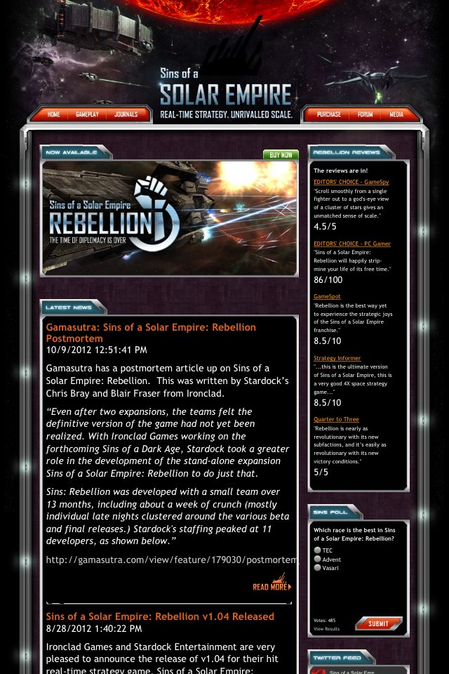
URL < https://www.sinsofasolarempire.com/ >
Link < www.sinsofasolarempire.com/ >
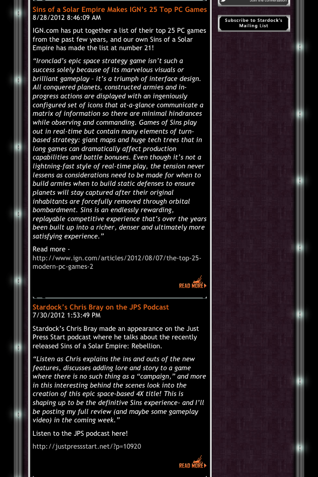
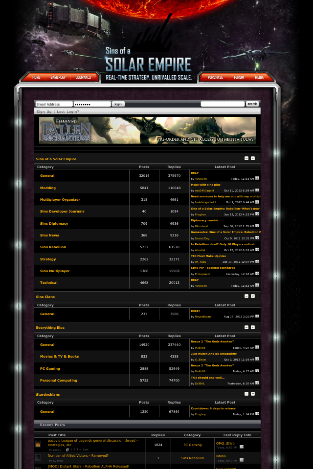
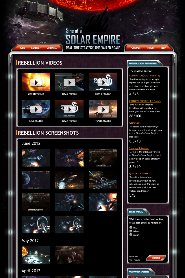
The specific purpose for this site is to give information on Stardock's game Sins of a Solar Empire. They have a customer service,they provide news about the game and they support existing customers. The site relies on multimedia elements such as graphics and texts. The site has lots of video's,pictures and forums. The use of backround colour and font nicely blend together. The backround is a very nice picture of a artist rendition of an in-game battle. The font is normal and easily readable. In the site you do not need to scroll to the right so it is a the perfect width. However you do need to scroll down to read all the text and there are too many ads in the forums. The URl fits with the website since the URL is the name of the game. The website does load all the various element within one second.
A Website that needs a little bit of work.
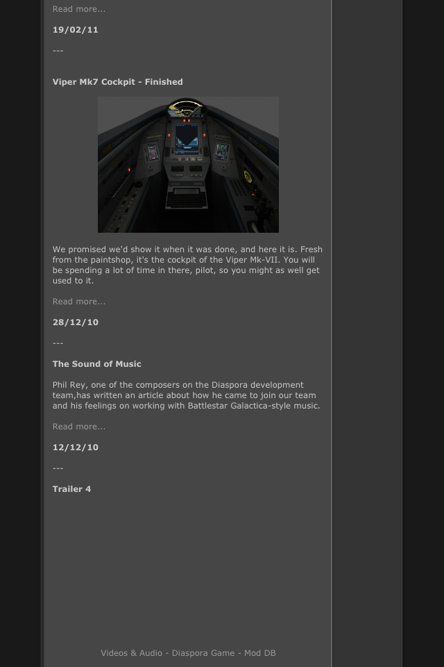
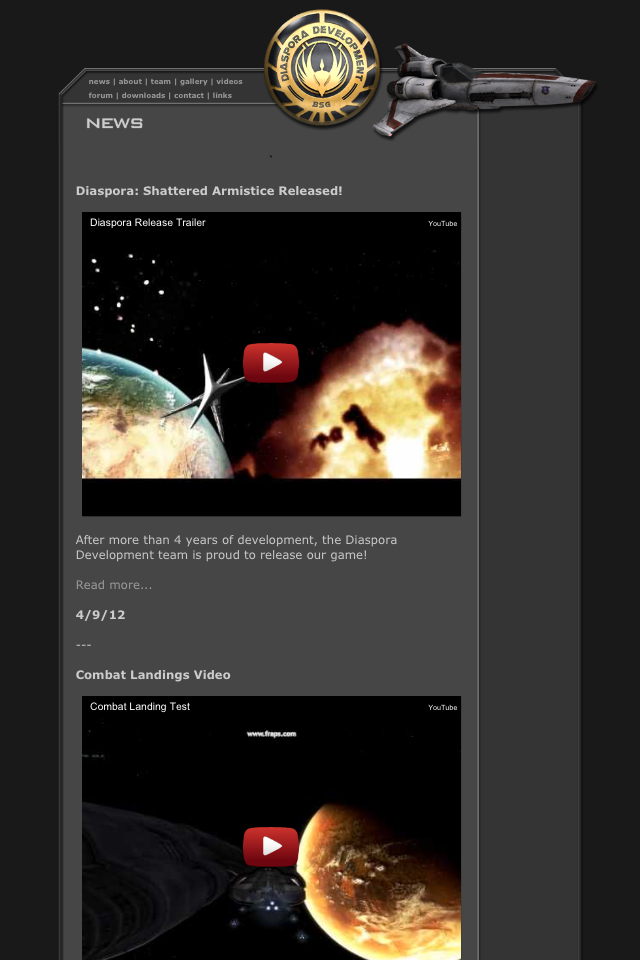
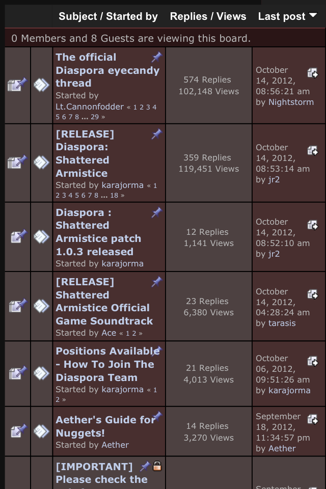
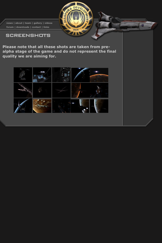
URL < https://diaspora.hard-light.net/ >
Link < diaspora.hard-light.net/ >
The purpose of this website is to give information on a Battlestar Galactica's Free-ware Game. The Url for the website is approtiate for the website. This site is updated regularly to keep fans up to date on their game. They have pictures and reviews about their game on their main site,however the link to their forum takes you a different games forum,they did this because "Diaspora" uses that games engine. The background is good because it is not to hard to read the writing. They have a seperate page for users that want to share their personal missions they have created on the game for people to download. Everything on the site loads reletivly fast. Their are only a couple issues of this website. The first is that they have a seperate tab for video's however they put the same exact video's in the "News" tab and when you click on the forum tab the background image for that site is very bad. The colors do not blend together and make it a sore-sight.
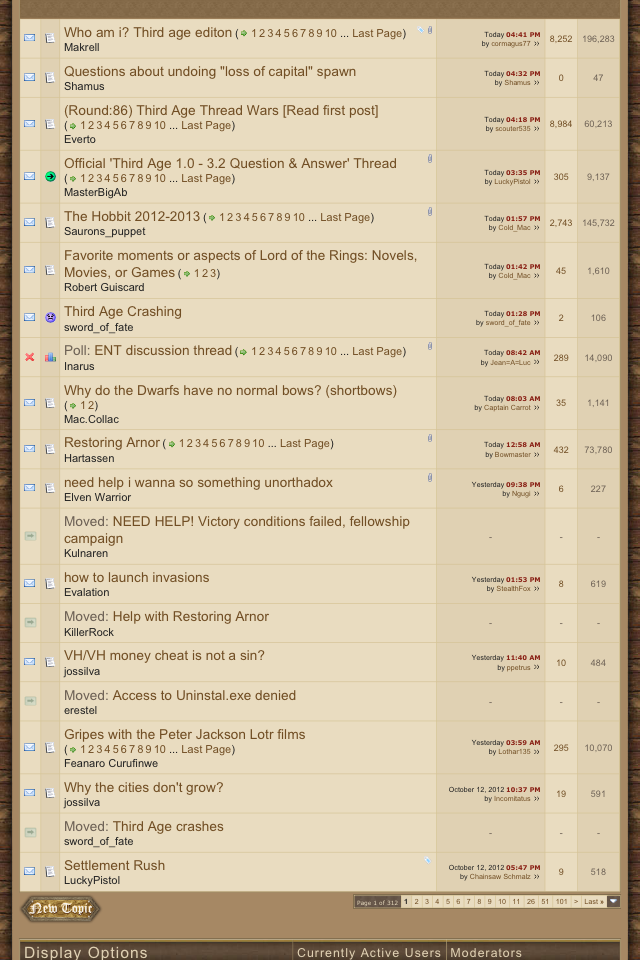
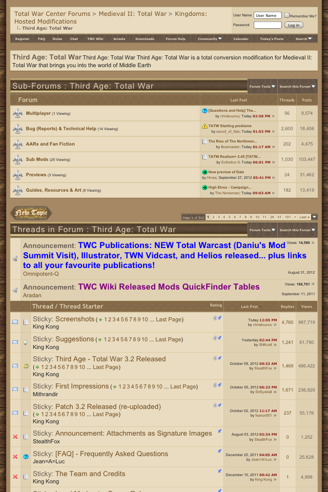
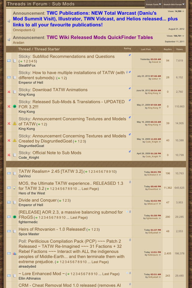
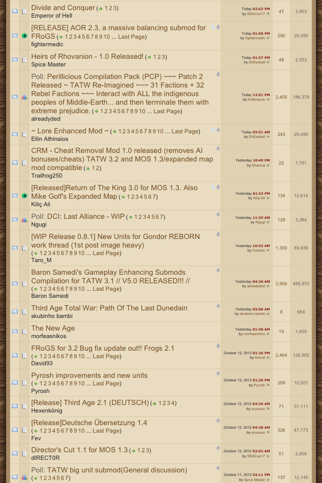
A Website that needs work.
URL < https://www.twcenter.net/forums/forumdisplay.php?f=654 >
This website is to keep people up to date on the Mod "Third Age Total War" for the game Medieval 2 Total war. This website has the perfect amount of sub topics and is very user friendly. This website does take about 3 seconds to load all of its data. The Url for this website is appropriate but a little to long, also the background text does not go well with the background it is kind off hard to read. Overall this website is good except for the URl and the color of the text.